
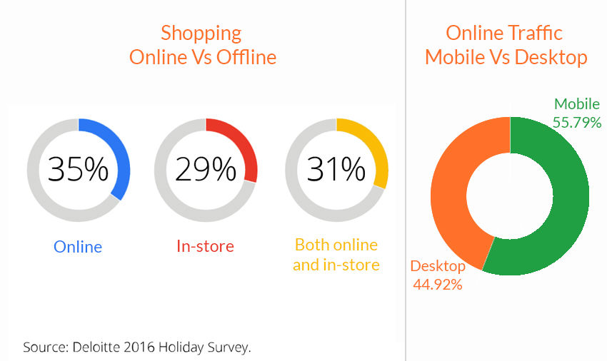
The first time more consumers shopped online than in-store was Black Friday 2015. Since then the graphs of online shopping are exponentially increasing. Perhaps greater shocking statistics is- more than half of that online traffic comes from mobile rather than desktop. Last year 70% of Wal-Mart’s Black Friday traffic came through mobile devices only.
It’s clear – Mobile is above all. You can not afford to ignore the importance of effective mobile strategies. With the holiday season on doorstep, mobile presents a huge opportunity for you to attract, engage with and reward numberless customers online. So how can you adopt mobile-first approach for your website? Here are five essential things to consider:
1. Is your website responsive:
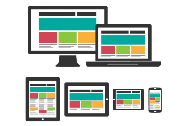
First thing first, your website must be capable of reshaping itself in various screen sizes before you can focus on making it mobile-first. Audit your website for mobile-friendliness (responsiveness). See if your mobile website meets Google’s standards. And don’t forget to keep all of your resources crawlable so you can detect potential problems such as:
– Improper size of touch targets. (Google recommends minimum 48 CSS pixels)
– Elements can not align themselves.
– Horizontal scrolling present.
– Zooming capabilities are disabled.
– Improper size of fonts.
– Slow mobile loading speed.
– Broken links or incorrect redirects.
– Uncompressed images.
– Missing meta descriptions.
– Blocked resources including JavaScript, CSS.
– Redirecting chains.
– Intrusive pop-ups.
– Unsupported or unplayable content.
As you examine your website for mobile friendliness issues, Google Search Console will be a handy tool to monitor your progress. Go to Search Traffic > Mobile Usability to track the number of pages on your website that still have problems.
Nowadays shoppers not only look for a flawless mobile experience but they also want to browse and buy on mobile just as easily as they can on desktop. Specially in the holiday seasons when they are at their busiest and don’t have time for sitting in front of desktops.
2. Accelerated Mobile Pages (AMPs)
More now than ever, online consumers expect things to be available instantly. Slow speed causes frustration among them. The ancient rule of 3 second response time isn’t applicable anymore. According to Nordstrom’s lead architect at the fashion retailer, they have seen a 11% fall in online sales when their website’s response time slows by just half a second. Bottom line is – Our mobile websites need to be lightning-fast.

To create such amazingly fast mobile websites we use AMPs i.e. Accelerated Mobile Pages. They’re approximately 4x faster than a regular mobile page.
All the more search engines (such as Google) promote them. AMPs offer mobile users exactly what they’re looking for: instant results that solve an immediate need.
AMPs are ‘web pages’ which use stripped down HTML coding and custom tags to achieve this lightning-fast loading speed. AMP version of web pages doesn’t contain any JavaScript, embedded content and lead forms, etc.
3. The Voice Search:

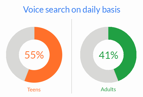
Voice search is the fastest growing type of search according to Behshad Behzadi, Principal Engineer at Google Zurich. He also believes conversational search is the future. By now, 55% of teens and 41% of adults use voice search on a daily basis, and that number is rising only.
So how can you optimize your website or specific pages for voice searches?
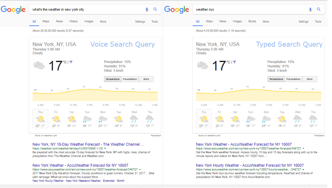
The most important thing while you go for this process is to understand this concept – How and why people verbally query a search engine differs from how they type queries.
This is How people use voice search: Queries typed in Google are usually ‘shortened’ whereas people ask ‘full questions’ when they use voice search. For example:
Now let’s see Why people use voice search: Google gives four different type of moments in which voice search is most commonly used:
– When people want to know something.
– When they want to go somewhere. (looking for a local services)
– When they want to do something. (the “how to” moments)
– When they want to buy something.
Each of these queries are directed towards an immediate need. The best way of optimizing for voice searches is to provide fast and accurate answers.
4. The Local Search:
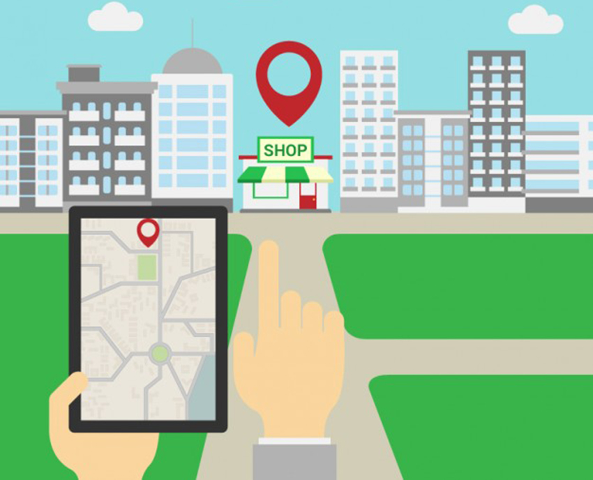
Majority of mobile searches are performed while on the go. People carry mobile phone everywhere and as soon as any question strikes their mind, they do a mobile search. Every time they want to know about any local business, services, people, reviews or anything else, they simply do an instant mobile search. This trend of rise in the local searches is growing only. According to Google, searches for “businesses near me” have increased 2x in the past year. This rising trend simply tells what our consumers really want. Most of the times they are only interested in the local businesses and services when performing a mobile search. If you truly want to be mobile-first, you need to be one of the top results whenever a potential customer do a search in your area.
5. Native Apps:

Native apps as you know are installed to mobile phones through an application store (such as Google Play or Apple’s App Store). They provide the quickest, most effective way to engage with, reward and transact with customers. Now what critically matters in using them fruitfully is ‘the way’ how you use all your online resources (in order to drive traffic as well as sales). One of the best strategy is-
Use every promotional emails, social media links and website content to drive the traffic back to your native app. Linking everything back to an exact page on the app (deep linking) is The KEY – consider it the new and improved SEO.

Enhancing the user experience on mobile website is of paramount importance. Let us take this approach of deep linking one step ahead. Instead of using native apps for this purpose, we can use Progressive Web Apps. You might have heard of them before, also that Progressive Web Apps being the future of mankind.
Progressive web apps are browser based mobile websites that bring features from the native web apps to the web browser. They are faster to build and less expensive. By using them you can make your website work offline, handle patchy network scenarios gracefully, update background content, send push notifications, do content caching and a lot more.
Final Words:
With every passing moment, we’re getting closer to the biggest shopping season of the year. Take a critical look at your mobile strategy and capitalize on what promises to be a banner Holiday 2017. Let us know whenever you need any help, either small or big, we will be happy to stand with you and make this holiday season one of your BIGGEST successes. Happy Holiday Season?
Related Posts


